Redesigning the
Letras apps
Full redesign of the native iOS and Android Letras apps, keeping the lyrics one tap away while adding recommendations, playlists and search.
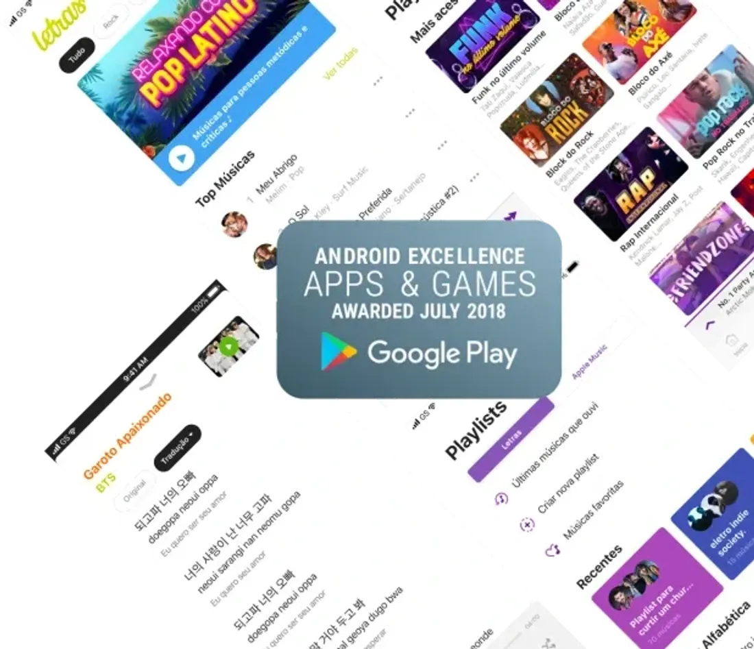
Letras is the largest lyrics platform in Latin America.
By 2018 the apps no longer reflected the brand's identity, nor kept up with what people had come to expect from a music app. We rethought the iOS and Android apps from scratch, holding on to the philosophy that always guided the product: simplicity and efficiency.
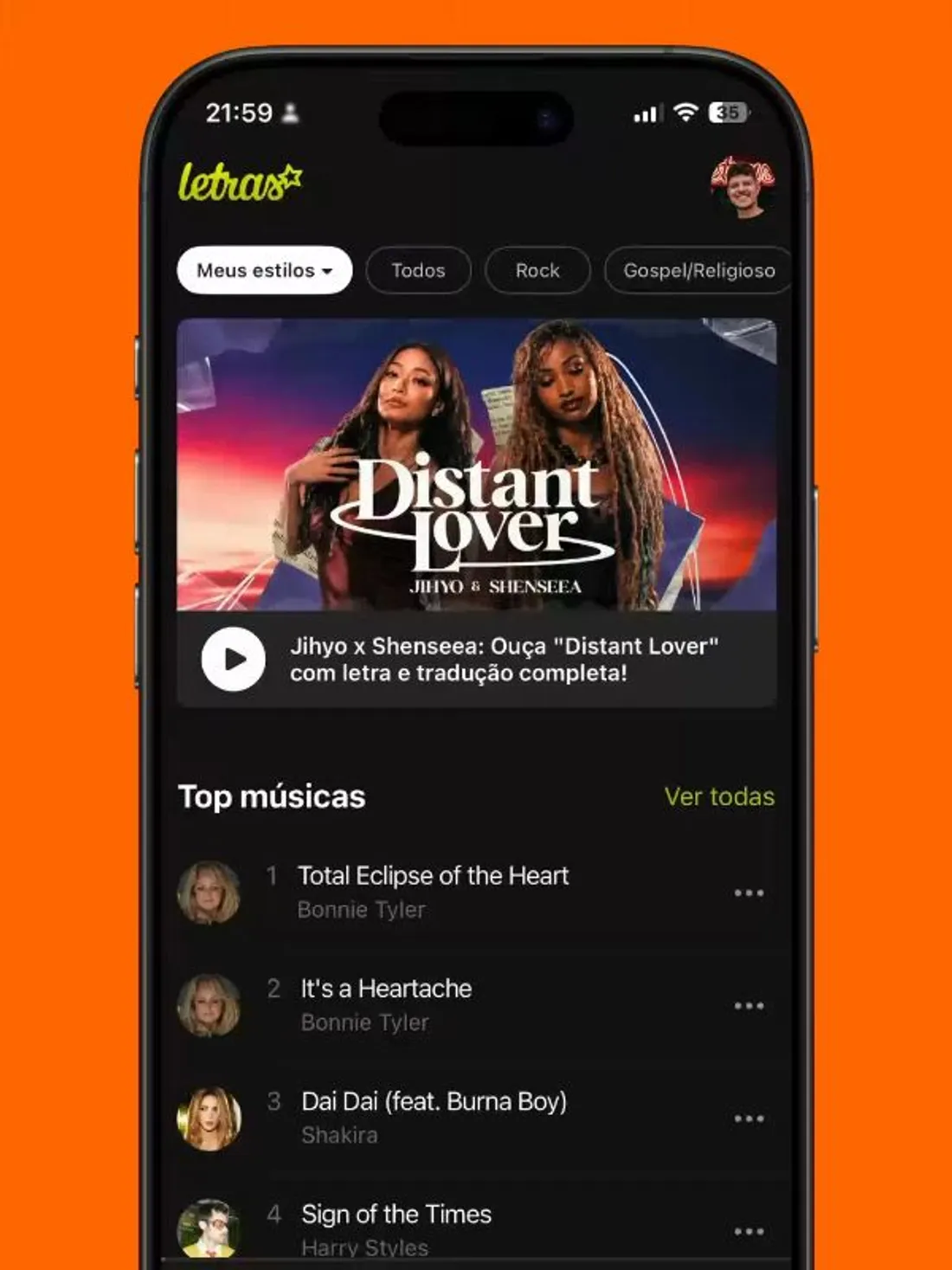
The core tension was growing
without bloating.
The product needed personalized recommendations, playlists and a better search, and each of those features pushed the app toward feeling generic, like any other player. The design question was how to gain depth without bloating the information architecture or taking away the thing people came for: reading a song's lyric with as little friction as possible.
There was also the fact that these were two apps. We chose native development on each platform so we wouldn't compromise on performance, which meant treating iOS and Android as sibling products, each true to its own system.
The lyric above everything
The reading screen is organized around an information hierarchy that demotes everything that isn't the lyric enough that it doesn't compete for focus. In most flows, people reach the content with no navigation detours.
I tuned contrast, type size and line height for legibility in long reads. Every flow, even the most complex, went through prototyping and usability testing before shipping.
The identity came from the content
The interface came out spare, in line with what Apple Music, Instagram and Airbnb were already doing, with a built-in risk of turning generic.
To dodge that, I let the content carry the color: the headers pull the dominant color from each album or playlist artwork. The restraint came from the layout and spacing; the identity, from the content, not from interface chrome.
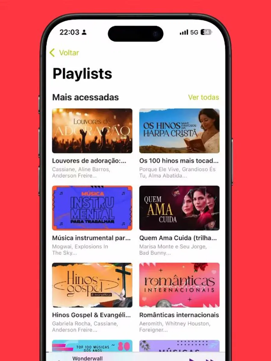
iOS and Android as sibling products
Since each app was native, I let the patterns follow the Human Interface Guidelines on iOS and Material on Android whenever the difference was systemic or cultural.
The clearest case was local downloads: on iOS there is no culture of listening to music downloaded on the device, so the app didn't carry that side, while Android did. I kept parity in the reading hierarchy and visual identity across both; only the behavior followed each platform's habits.
When the constraint became the solution
The connection with streaming services took real research, but in practice we couldn't get the stability we wanted.
Instead of dropping the idea, I turned it into contextual re-engagement: the app started detecting when someone was listening to a song and firing a push that opens straight to the lyric screen, via deep link, on tap.
The constraint ended up pointing to a simpler solution, better aligned with the real moment of use, when someone is already listening and just wants the lyric in hand.
This was my first leadership experience, still a technical one. On iOS I owned the project: I defined and drove the initiatives and worked directly with the PO. I worked with two interns and, since I wasn't responsible for managing them as designers, I brought them along as participants in everything, on the belief that an internship is there to learn before it's there to deliver.
After the launches, the store rating, which used to swing a lot, settled at 4.9 on both iOS and Android. The Android app made the Google Excellence Apps 2018 list, Google's curated selection of the highest-quality apps on the Play Store. Together, the apps passed, and still hold today, the mark of over one million monthly active users.
Credits
iOS
- Lead Designer
- Josue Macedo
- Design interns
- Henrique Karaim, Thales Silva, Fernando Dilton
Android
- Product Designer
- Josue Macedo, Vitor Amaral
- Design Manager
- Juliana Araújo
Tools
Sketch · Abstract · Zeplin